Conversion optimization guide · 10 min read
12 Landing Page A/B Test Ideas to Improve Conversion Rate
A landing page does not need a wholesale redesign to become clearer and more useful. The best A/B tests isolate one decision barrier—understanding the offer, trusting the brand, or taking the next step—then measure whether the change helps the right visitors convert.
Start with the visitor’s decision barrier
Before changing a headline or button color, identify what stops visitors from moving forward. Review search terms, ad-message alignment, session recordings, user research, support questions, and the funnel by device and traffic source. A headline test is useful when the value proposition is unclear; it is not a substitute for fixing a broken mobile form or a slow page.
Write a hypothesis that connects one change to one visitor concern: “Explaining setup time beside the primary call to action will increase qualified demo requests from paid-search visitors.” This makes the result useful even if the variation loses.
Twelve landing page tests worth considering
- Message match: reflect the problem and language that brought a visitor from a specific campaign.
- Value proposition: test a concise outcome-led headline against a feature-led headline.
- Primary CTA: test a specific next step such as “See the workflow” against a generic label.
- CTA context: add a short expectation near the button, such as what happens after sign-up.
- Proof placement: test a relevant customer quote, evidence, or trust marker near the decision point.
- Form burden: remove an unnecessary field or defer qualification until after the first step.
- Offer clarity: explain who the product is for and what is included before asking for a commitment.
- Product evidence: test a focused product view or workflow explanation against generic imagery.
- Objection handling: answer a high-frequency question about security, implementation, pricing, or compatibility.
- Navigation focus: test a reduced-distraction page only when visitors still have a clear path to needed information.
- Mobile hierarchy: make the value, CTA, and key proof easy to scan without a desktop-first layout.
- Load experience: test a simpler or better-prioritized page only after protecting performance and accessibility.
Do not combine the full list into one “new landing page.” A bundled redesign can make a result impossible to explain.
Measure conversion quality, not just clicks
Choose the deepest outcome that can be read in a reasonable time: completed purchase, activated account, qualified demo request, or booked meeting. Add guardrails that expose a misleading win, such as form-error rate, lead validity, trial-to-paid conversion, refund rate, sales acceptance, or page performance.
Segment only where the visitor question meaningfully differs. Paid-search visitors may need different evidence than returning brand visitors, but slicing the result into dozens of groups after launch creates false stories. Decide the primary audience, metric, and meaningful effect before traffic enters.
A practical launch checklist
- Keep the offer, eligibility, tracking, and follow-up process the same in both variations.
- Assign visitors consistently, including across repeat visits and devices where your identity model supports it.
- QA desktop and mobile layouts, analytics events, form errors, consent states, and the control fallback.
- Plan sample size and minimum detectable effect before checking the dashboard.
- Ship only changes that meet the decision rule and do not harm agreed guardrails.
For more detail on planning a trustworthy experiment, use the A/B test planning checklist. If your landing page needs a sharper message rather than a layout change, the website copy testing framework can help you design a focused next test.
See a focused landing-page variation
Visual editing works best when it turns a clear hypothesis into one visible change. Here, the editor identifies the hero section and offers specific actions—such as changing the image, headline, or button—rather than encouraging an unstructured redesign.
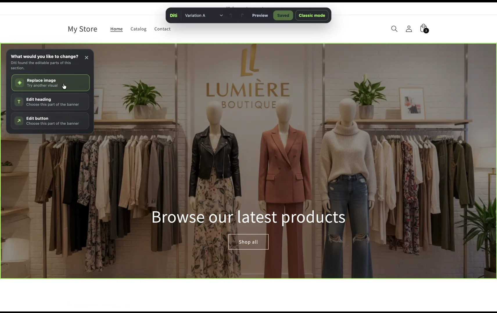
For example, test a new product image or a clearer hero message—but not both in the same first test if your goal is to learn which decision barrier mattered.
Put the guide into practice
Build your next experiment with Diti.
Turn a focused customer question into a test your team can preview, launch, and learn from.
Start testing with Diti ↗About this guide
Reviewed by Diti's experimentation team
Diti's product and experimentation team maintains these guides for people planning, launching, and evaluating real product experiments. We update them as our workflow and platform guidance evolves.
Keep learning